Class AbstractInputBuilder<T extends AbstractInputBuilder,VT>
- Direct Known Subclasses:
AbstractDmFilterBuilder,AbstractProductAndCustomerInputBuilder,AbstractSliderBuilder,ButtonInputBuilder,CollapseInputBuilder,ConfiguratorInputBuilder,ConfiguratorTableInputBuilder,CustomFormListPopupInputBuilder,DashboardInputsInputBuilder,DashboardPopupInputBuilder,DateRangeInputBuilder,DMFieldInputBuilder,DmFilter,DmQueryBuilderInputBuilder,DMSourceInputBuilder,FilterBuilderInputBuilder,InputMatrixInputBuilder,MultiTierInputBuilder,OptionInputBuilder,ResultMatrixFilterBuilder,RowInputBuilder,SimpleInputBuilder,StringInputBuilder,TreeInputBuilder,VLookupBuilder
-
Nested Class Summary
Nested Classes -
Field Summary
Fields -
Constructor Summary
ConstructorsConstructorDescriptionAbstractInputBuilder(InputBuilderContext builderContext) AbstractInputBuilder(InputBuilderContext builderContext, InputType type, String paramName) Constructor cannot be used forInputType.DMDIMFILTERandInputType.LOOKUPContextParameterwill throwAssertionErrorexception for these types. -
Method Summary
Modifier and TypeMethodDescriptionprotected abstract ObjectaddOrUpdateInput(CalculableLineItemCollectionBuilder clicBuilder, String lineId) Adds (or updates) this input field (defined by this builder) to the specified header line item.Deprecated.addToConfiguratorEntry(ConfiguratorEntry ce, Closure defaultValue) Deprecated.addToFormLayout(FormLayoutNode layout) Builds the input field definition and adds it to the specified form layout.Builds and returns the input field definition object.Builds the input field definition the same way asgetInput()and returns the resultingContextParameterobject.buildMap()Builds a map with input field definition.final ObjectgetInput()Builds the input field definition (ContextParameter) - the object representation of the input field.protected voidregisterFrontendEvent(String eventName, List<String> lockInputNames, List<String> excludeInputNames) Populates theregisteredFrontendEventsfield onContextParameterwith given parameters.protected Tself()setAccessCode(String accessCode) N/A - the method has not been implemented in the user interface yet.N/A - the method has not been implemented in the user interface yet.Enables all types value tracking for a specifiedContextParameter.Sets the input field as always editable.
Editable input fields are always supported in Unity UI only (not supported in Classic UI).
Enables a user to update the input field after the Quote, Contract, or Rebate Agreement have been submitted.setAppearance(String appearance) N/A - the method has not been implemented in the user interface yet.setAutoComplete(boolean autoComplete) N/A - the method has not been implemented in the user interface yet.setAutoFocus(boolean autoFocus) If this is set to true, the browser scrolls to the element when the page is loaded and automatically focuses it (places a cursor into the input field).
On the given page the autofocus should be placed in only one input.setCaption(String caption) N/A - the method has not been implemented in the user interface yet.setConfigValues(List<String> configValues) Adds values to the input field (parameter).setCustomAttributeName(String name) Creates the custom name data attribute in the form's HTML.
Must be used together withsetCustomAttributeValue(String).setCustomAttributeValue(String value) Creates the custom value data attribute in the form's HTML.
Must be used together withsetCustomAttributeName(String).setDefaultValueTracking(boolean isDefaultValueTracked) Enables or disables tracking of the default value for a specifiedContextParameterwithin the ConfiguratorEntry.
Default value tracking allows you to detect whether an input retains its original default value or if it has been changed by the user or programmatically.Sets the default width of the widget.setDisabled(boolean disabled) Hides the input from the user interface.setDisplayMode(String displayMode) N/A - the method has not been implemented in the user interface yet.setErrorMessage(String msg) N/A - the method has not been implemented in the user interface yet.setExportable(boolean exportable) N/A - the method has not been implemented in the user interface yet.setFirstRunTracking(boolean isFirstRunTracked) Enables or disables tracking of the input's first run for a specifiedContextParameterwithin the ConfiguratorEntry.
First, run tracking allows detecting whether an input was initialized (run for the first time).setFlex(int flex) When more input fields are placed side by side (using the row layout, via RowInputBuilder), the "flex" value sets how much space this input field should occupy (proportionally) with respect to the other inputs on the same row.setHelpLink(String helpLink) Displays a question mark icon next to the field label and displays the "Learn more" link when a user hovers the mouse over the icon.setHelpText(String helpText) Displays a question mark icon next to the input field label and displays the specifiedhelpTextwhen a user hovers the mouse over this icon.N/A - the method has not been implemented in the user interface yet.setIconPosition(String iconPosition) N/A - the method has not been implemented in the user interface yet.setImportable(boolean importable) N/A - the method has not been implemented in the user interface yet.Sets the specified text as a label of the input field.setLabelPlacement(String labelPlacement) N/A - the method has not been implemented in the user interface yet.setLabelStyle(String labelStyle) N/A - the method has not been implemented in the user interface yet.setLabelTranslations(Map<String, String> translations) Sets the translation of the label.setLayoutGridName(String layoutGridName) N/A - the method has not been implemented in the user interface yet.setLogActivity(Boolean logActivity) setNoRefresh(boolean noRefresh) Prevents the Configurator refresh when the value of the field is changed.
By default, the Configurator form will refresh every time when the user changes some input value, i.e., the Configurator logic will be executed again, and the content of the form will be refreshed.Creates collapsible sections to organize input fields in the UI.setPlaceholderText(String text) Places the specified text to the input field as a placeholder.setPreviousValueTracking(boolean isPreviousValueTracked) Enables or disables the tracking of the previous value for a specifiedContextParameterwithin the ConfiguratorEntry.setReadOnly(Boolean ro) Sets the input field as read-only.setRequired(Boolean required) Sets the input field as mandatory.protected TsetShowInline(boolean enable) N/A - the method has not been implemented in the user interface yet.setStoreAuditTrail(Boolean storeAuditTrail) setSuccessMessage(String msg) N/A - the method has not been implemented in the user interface yet.Assigns the InputBuilder entry (or configurator) to a specific tab in a multitab dashboard step.N/A - the method has not been implemented in the user interface yet.Displays the specified text as a tooltip when a user hovers the mouse over the input field label.setTrackedValue(VT value) Method is design to set the value only for value-tracking inputs.
NOTE:
the method needs to be used after the set tracking features, if notConfiguratorEntryException.ValueNotTrackedExceptionis thrown.setUserGroupEdit(String userGroupName) Sets the userGroupEdit property for the input.
NOTE each usage of the method on a single input will override the value Example:setUserGroupEdit(Collection<String> userGroupNames) Sets the userGroupEdit property for the input.
nullor emptyCollectionsets the property tonullwhich means no restrictions.
NOTE if concatenation ofuserGroupNames(with comma delimiter) exceeds theDB_MAX_STRING_LENGTHcharacters limit, the value is not set each usage of the method on a single input will override the value Example:setUserGroupView(String ugv) Sets the userGroupView property for the input.setUserGroupView(List<String> userGroupNames) Sets the userGroupView property for the input.Prefills the input field with the specified value.
For line item logics (on Quotes, Rebates, Price Lists, ...) works in the input generation mode only and has no effect in the regular execution mode.
Warning: if used on headers or configurators, the value prefilled by the setValue will overwrite a user-entered value when the user clicks the Recalculate button (Header) or jumps to another line/closes the dialog (Configurator).setValueChangeTracking(boolean isValueChangeTracked) Enables or disables tracking of value changes for a specifiedContextParameter.setValueHint(String valueHint) Adds the specified hint next to the input field.setWarningMessage(String msg) N/A - the method has not been implemented in the user interface yet.Sets the width of the input field on the screen.
-
Field Details
-
cp
-
builderContext
-
-
Constructor Details
-
AbstractInputBuilder
Constructor cannot be used forInputType.DMDIMFILTERandInputType.LOOKUPContextParameterwill throwAssertionErrorexception for these types. -
AbstractInputBuilder
-
-
Method Details
-
_getInput
-
getInput
Builds the input field definition (ContextParameter) - the object representation of the input field. This should be called as the last operation, after you did set all the various properties of the input field.When executed in Input Generation mode, this method also puts the input field definition to logic context, and once the logic finishes, the engine reads the definitions of the input fields from that context. Then they're usually rendered on the UI.
When executed in regular execution, it returns the value entered by the user in UI - so you could potentially use this function also to read the entered value. But we suggest using the binding variable
input.Use this method only in line items logics (quote/contract/rebate item, price list/live price list logic, calculated field set logic, dataload row context logic), and dashboard logic to build filters.
Do not use it in header logics, and configurator forms, because those are using different methods to build/add the input field.
Example:
if (api.isInputGenerationExecution()) { api.inputBuilderFactory() .createMultiTierEntryInputBuilder("MultiTier") .setLabel("MultiTier") .setValue([ "10" : "20", "20" : "40" ]) .getInput() } else { input.MultiTier }- Returns:
- In Input Generation mode, the returned value is a random value. In regular execution, it returns the value of the input field (which user usually enters in UI). The value could be stored in a special object.
- Since:
- 5.1 - Collins
-
setLabel
Sets the specified text as a label of the input field. The label is usually displayed above, or next to the input field.Example:
def userEntry = api.inputBuilderFactory() .createOptionEntry("Country") .setLabel("Select Country") .setOptions(["CZ", "DE", "UK"]) .getInput()- Parameters:
label- The text that is displayed as a label of the input field.- Since:
- 5.1 - Collins
-
setLabelTranslations
Sets the translation of the label.If the label translation is specified for a specific language, then this translation is used when the UI is switched into that language.
If the 2-letter language code string is left empty, it will be used as the default translation in case the UI is switched to a language, for which you did not supply the corresponding translation.
Example:
def ce = api.createConfiguratorEntry() api.inputBuilderFactory() .createStringUserEntry("InputFieldName") .setLabel("English label") .setLabelTranslations( [ "de": "Deutsche Bezeichnung", "es": "Etiqueta española" ] ) .addToConfiguratorEntry(ce) return ce- Parameters:
translations- The map that defines language codes (2-letterISO 639-1) and input field labels.- Since:
- 5.2 - Collins
- See Also:
-
setRequired
Sets the input field as mandatory.The field is marked with an asterisk (*) in the user interface. The user must enter a value to this input field. Otherwise, the form (in any location - e.g., header, dashboard, line item, etc.) cannot be submitted (or settings applied, where applicable).
If a pop-up Configurator includes a required input and the user does not open it, the user will be able to save the document even though the input is not filled in. The reason is that the application is not able to check if there is a required input until the user opens the Configurator.The default value:
false- Parameters:
required- Set totrueto mark the input field as required in the user interface.- Since:
- 6.2 - Vesper
-
setReadOnly
Sets the input field as read-only.The user cannot enter or edit the value in this field.
The default value:
false- Parameters:
ro- Set totrueto set the input field as read-only.- Since:
- 6.2 - Vesper
-
setAlwaysEditable
Sets the input field as always editable.
Editable input fields are always supported in Unity UI only (not supported in Classic UI).
Enables a user to update the input field after the Quote, Contract, or Rebate Agreement have been submitted.Note: If the user has the DataIntegration user role assigned, this method may not work correctly.
The default value:
false- Parameters:
ae- Set totrueto set the input field as always editable.- Since:
- 6.2 - Vesper
-
setValue
Prefills the input field with the specified value.
For line item logics (on Quotes, Rebates, Price Lists, ...) works in the input generation mode only and has no effect in the regular execution mode.
Warning: if used on headers or configurators, the value prefilled by the setValue will overwrite a user-entered value when the user clicks the Recalculate button (Header) or jumps to another line/closes the dialog (Configurator).- Parameters:
value- The value to be set as default in the input field.- Since:
- 5.1 - Collins
-
setTrackedValue
Method is design to set the value only for value-tracking inputs.
NOTE:
the method needs to be used after the set tracking features, if notConfiguratorEntryException.ValueNotTrackedExceptionis thrown.Example:
// First element (creates test input in configurator entry with value set to 'Actual' in the inputs generation mode) def configuratorEntry = api.createConfiguratorEntry() api.inputBuilderFactory() .createOptionEntry('test') .setOptions(['Forecast', 'Actual']) .setFirstRunTracking(true) .setTrackedValue('Actual') // needs to be after setFirstRunTracking() .addToConfiguratorEntry(configuratorEntry) return configuratorEntry // Second element (aboard on the input generation mode) if (api.isInputGenerationExecution()) api.abortCalculation() // Third element (get first run flag value of the test-input and return it in the text-user-entry) def isFirstRun = out.First.isFirstRun('test') def configuratorEntry = api.createConfiguratorEntry() configuratorEntry.inputs = [ api.inputBuilderFactory() .createTextUserEntry('Test input first run flag') .setValue(isFirstRun) .buildContextParameter()] return configuratorEntry- Parameters:
value- The value to be set.- Since:
- 14.0 - Caribou Lou
- See Also:
-
setValueHint
Adds the specified hint next to the input field.Note: This method is available only for
MultiTierEntry.
Tip: To add different hints next to the field of each column, usesetValueHint("Value^^^%")(see the screenshot below).Example:
The input field is rendered as follows:if (api.isInputGenerationExecution()) { def mTier = api.inputBuilderFactory() .createMultiTierEntryInputBuilder("multiTier") .setLabel("Multi Tier") .setValueHint("Value^^^%") .setValue([ "1000000" : "20", "2000000" : "50" ]) .getInput() } else { input.multiTier }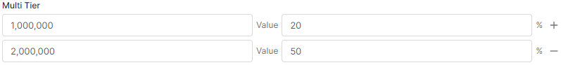
- Parameters:
valueHint- The text content of the hint.- See Also:
-
setNoRefresh
Prevents the Configurator refresh when the value of the field is changed.
By default, the Configurator form will refresh every time when the user changes some input value, i.e., the Configurator logic will be executed again, and the content of the form will be refreshed. If this is an issue for you (e.g., slowing down your work), you can disable the auto-refresh using the setNoRefresh method.
This option is supported by all input types.The default value:
false- the form is refreshed every time when the user changes the input value.- Parameters:
noRefresh- Set totrueto prevent the form refresh.- Since:
- 5.1 - Collins
-
setConfigValues
Adds values to the input field (parameter).This can be used, for example, for setting values of the drop-down input field.
- Parameters:
configValues- The list of values you want to add to the input field (parameter).
-
setParameterGroup
Creates collapsible sections to organize input fields in the UI.You can assign
parameterGroupto each parameter (input field) to categorize them into sections. The order of parameter groups (sections) is based on the order in which they are "created" (declared) when the logic is executed. There is one default group for all those that do not haveparameterGroupassigned.- Parameters:
pg- The name of theparameterGroup- Since:
- 6.2 - Vesper
-
setPlaceholderText
Places the specified text to the input field as a placeholder.The placeholder text disappears once the user starts typing to this input field. This gives a user the hint of the expected value.
- Parameters:
text- The text of the placeholder.- Since:
- 7.1 - Bijou
-
setImportable
N/A - the method has not been implemented in the user interface yet.The default value:
false -
setExportable
N/A - the method has not been implemented in the user interface yet.The default value:
false -
setTheme
N/A - the method has not been implemented in the user interface yet. -
setAppearance
N/A - the method has not been implemented in the user interface yet. -
setSize
N/A - the method has not been implemented in the user interface yet. -
setDefaultWidth
Sets the default width of the widget. This value is also inherited down to widget’s children.Setting of the default width is meant to be used with Configurators and layouts Row and Collapse.
Accepted values are:
If another value is used or not set, then the default width is assigned to large.InputWidth.LARGE - 800px or 100% of available space InputWidth.MAX - 100% of available space Example:
Please note: theInputWidthmust be imported at the beginning of your Groovy code, or the full path to theAbstractInputBuilder.InputWidthmust be specified in the setDefaultWidth parameter.import net.pricefx.formulaengine.scripting.inputbuilder.AbstractInputBuilder.InputWidth if (api.isInputGenerationExecution()) return def contextParameter = api.inputBuilderFactory() .createStringUserEntry('MyEntry') .setDefaultWidth(InputWidth.MAX) .buildContextParameter() def rowInputBuilder = api.inputBuilderFactory() .createRowLayout('MyRowLayout') .addInput(contextParameter) .buildMap() // will create the string user entry 100% of available space long- Parameters:
width- the default width as InputWidth.LARGE or InputWidth.MAX (other InputWidths will be treated as InputWidth.LARGE)- Returns:
- The same instance of this class.
- See Also:
-
setWidth
Sets the width of the input field on the screen. Accepted values are:
If another value is used or not set, then the width is assigned to large.InputWidth.SMALL - 200px or 25% of available space InputWidth.MEDIUM - 400px or 50% of available space InputWidth.LARGE - 800px or 100% of available space InputWidth.MAX - 100% of available space Example:
Please note: theInputWidthmust be imported at the beginning of your Groovy code, or the full path to theAbstractInputBuilder.InputWidthmust be specified in the setWidth parameter.import net.pricefx.formulaengine.scripting.inputbuilder.AbstractInputBuilder.InputWidth if (api.isInputGenerationExecution()) return def contextParameter = api.inputBuilderFactory() .createStringUserEntry('MyEntry') .setWidth(InputWidth.SMALL) .buildContextParameter() def rowInputBuilder = api.inputBuilderFactory() .createRowLayout('MyRowLayout') .addInput(contextParameter) .buildMap() // will create the string user entry 200px (or 25% of available space) long- Parameters:
width- the InputWidth enum as InputWidth.SMALL, InputWidth.MEDIUM, InputWidth.LARGE or InputWidth.MAX- Returns:
- The same instance of this class.
- See Also:
-
setTab
Assigns the InputBuilder entry (or configurator) to a specific tab in a multitab dashboard step.Tabs are defined in the Model Class (MC) JSON under the
dashboardTabskey. This method controls in which UI tab the entry will be displayed. If the tab name is not recognized (i.e., not defined in the MC), the entry falls back to the default tab. Such cases are logged to the console.Validation behavior:
- On apply, only the currently visible tab is validated first.
- If it contains invalid entries, only this tab is marked with an error icon.
- If it is valid, other tabs are then validated and may be marked if they contain errors.
Example:
api.inputBuilderFactory().createUserEntry("stringUserEntry") .setLabel("myTab") .setTab("rccontext") .getInput();- Parameters:
tabName- Name of the tab as defined indashboardTabs- Returns:
- The current instance of this class.
- Since:
- 15.0 - Southside
- See Also:
-
setTitle
Displays the specified text as a tooltip when a user hovers the mouse over the input field label.Example:
def ce = api.createConfiguratorEntry() api.inputBuilderFactory() .createStringUserEntry("InputFieldName") .setLabel("The Label") .setTitle("The Title") .addToConfiguratorEntry(ce) return ce- Parameters:
title- The text of the tooltip.
-
setCaption
N/A - the method has not been implemented in the user interface yet. -
setHelpText
Displays a question mark icon next to the input field label and displays the specifiedhelpTextwhen a user hovers the mouse over this icon.- Parameters:
helpText- The text to be displayed when a user hovers over the icon.- Since:
- 7.1 - Bijou
-
setHelpLink
Displays a question mark icon next to the field label and displays the "Learn more" link when a user hovers the mouse over the icon.Clicking on the "Learn more" text will open the specified
helpLinkdestination. We recommend using this function together withsetHelpText(String)- Parameters:
helpLink- The target URL.- Since:
- 7.1 - Bijou
-
setIcon
N/A - the method has not been implemented in the user interface yet. -
setIconPosition
N/A - the method has not been implemented in the user interface yet. -
setLabelPlacement
N/A - the method has not been implemented in the user interface yet. -
setLayoutGridName
N/A - the method has not been implemented in the user interface yet. -
setErrorMessage
N/A - the method has not been implemented in the user interface yet. -
setWarningMessage
N/A - the method has not been implemented in the user interface yet. -
setSuccessMessage
N/A - the method has not been implemented in the user interface yet. -
setUserGroupView
Sets the userGroupView property for the input.nullwhich means no restrictions.NOTE
- if concatenation of
userGroupNames(with comma delimiter) exceeds theDB_MAX_STRING_LENGTHcharacters limit, the value is not set - each usage of the method on a single input will override the value
def ce = api.createConfiguratorEntry() // sets the input's userGroupView property to 'userGroupA' def input = api.inputBuilderFactory() .createOptionEntry('inputB') .setOptions(['S', 'M', 'L']) .setValue('S') .setUserGroupView('userGroupA') .buildContextParameter()- Parameters:
ugv- user group name as String- Returns:
- The same instance of this class.
- if concatenation of
-
setUserGroupView
Sets the userGroupView property for the input.nullor emptyCollectionsets the property tonullwhich means no restrictions.NOTE
- if concatenation of
userGroupNames(with comma delimiter) exceeds theDB_MAX_STRING_LENGTHcharacters limit, the value is not set - each usage of the method on a single input will override the value
// sets the input's userGroupView property to 'userGroupA,userGroupB' def input = api.inputBuilderFactory() .createOptionEntry('inputB') .setOptions(['S', 'M', 'L']) .setValue('S') .setUserGroupView(['userGroupA', 'userGroupB']) .buildContextParameter()- Parameters:
userGroupNames- Collection of user group names- Returns:
- The same instance of this class.
- if concatenation of
-
setUserGroupEdit
Sets the userGroupEdit property for the input.
NOTE- each usage of the method on a single input will override the value
def ce = api.createConfiguratorEntry() // sets the input's userGroupEdit property to 'userGroupA' def input = api.inputBuilderFactory() .createOptionEntry('inputB') .setOptions(['S', 'M', 'L']) .setValue('S') .setUserGroupEdit('userGroupA') .buildContextParameter()- Parameters:
userGroupName- user group name as String- Returns:
- The same instance of this class.
-
setUserGroupEdit
Sets the userGroupEdit property for the input.
nullor emptyCollectionsets the property tonullwhich means no restrictions.
NOTE- if concatenation of
userGroupNames(with comma delimiter) exceeds theDB_MAX_STRING_LENGTHcharacters limit, the value is not set - each usage of the method on a single input will override the value
// sets the input's userGroupEdit property to 'userGroupA,userGroupB' def input = api.inputBuilderFactory() .createOptionEntry('inputB') .setOptions(['S', 'M', 'L']) .setValue('S') .setUserGroupEdit(['userGroupA', 'userGroupB']) .buildContextParameter()- Parameters:
userGroupNames- Collection of user group names- Returns:
- The same instance of this class.
- if concatenation of
-
setDisplayMode
N/A - the method has not been implemented in the user interface yet. -
setAccessCode
N/A - the method has not been implemented in the user interface yet. -
setAlign
N/A - the method has not been implemented in the user interface yet. -
setLabelStyle
N/A - the method has not been implemented in the user interface yet. -
setAutoComplete
N/A - the method has not been implemented in the user interface yet. -
setAutoFocus
If this is set to true, the browser scrolls to the element when the page is loaded and automatically focuses it (places a cursor into the input field).
On the given page the autofocus should be placed in only one input. For the radio group, the first element will be focused. If the input is in the read-only mode, autofocus will not be applied.The default value:
false- Parameters:
autoFocus- Set totrueto enable autofocusing the element.- Since:
- 8.0 - Godfather
-
setDisabled
Hides the input from the user interface.Supported input types:
InputType.CONFIGURATOR(hides the "Open" button)Example:
def configurator = api.inputBuilderFactory() .createConfiguratorInputBuilder("configurator", "InputsGenericLogic", false) .setLabel("Configurator") .setDisabled(true) .buildMap() quoteProcessor.addOrUpdateInput(configurator)- Parameters:
disabled- Set totrueto disable the user input.- Since:
- 11.2.0 - Paper Plane
-
setCustomAttributeName
Creates the custom name data attribute in the form's HTML.
Must be used together withsetCustomAttributeValue(String).The resulting HTML:
data-custom-AttributeName="AttributeValue".- Parameters:
name- The name of the custom attribute.- Since:
- 7.1 - Bijou
-
setCustomAttributeValue
Creates the custom value data attribute in the form's HTML.
Must be used together withsetCustomAttributeName(String).For example,
data-custom-AttributeName="AttributeValue".- Parameters:
value- The value of the custom attribute.- Since:
- 7.1 - Bijou
-
setFlex
When more input fields are placed side by side (using the row layout, via RowInputBuilder), the "flex" value sets how much space this input field should occupy (proportionally) with respect to the other inputs on the same row.For example, if you place 3 inputs side by side, all with the same flex (e.g., value 1), they will have the same width. If you make two inputs with flex=1 and one input with flex=2, then the input with flex=2 will occupy half of the space, and the other 2 inputs one quarter each.
If you do not set any value to an input field, it will use value 1.
Set this value only for inputs, which are placed to the side-by-side layout. Otherwise, the value is ignored.
Note: not supported in Ember and Classic UI.
- Parameters:
flex- value to define the width of the input field, with respect to the other input fields placed side by side in the same row.- See Also:
-
buildMap
Builds a map with input field definition. It is aContextParameterdefinition converted to a map.This is used in header logic, to build the map (input field definition), which is then added to the header using
addOrUpdateInput(CalculableLineItemCollectionBuilder, String)Example:
def deliveryType = api.inputBuilderFactory() .createOptionEntry("DeliveryType") .setLabel("Delivery Type") .setRequired(true) .setOptions(["Express", "Standard"]) .setLabels(["Express": "Express Delivery", "Standard": "Standard Delivery"]) .buildMap() quoteProcessor.addOrUpdateInput(deliveryType)- Returns:
- The input field definition as a map.
- Since:
- 5.1 - Collins
-
buildContextParameter
Builds and returns the input field definition object.This is used only in Configurator form logics.
Example:
def formFieldSet = api.createConfiguratorEntry() def meatInputField = api.inputBuilderFactory().createOptionEntry("Meat") .setOptions(["Beef", "Lamb", "Pork"]) .buildContextParameter() formFieldSet.inputs = [meatInputField] return formFieldSet- Returns:
- The input field definition object (
ContextParameter). - Since:
- 5.1 - Collins
- See Also:
-
addOrUpdateInput
Adds (or updates) this input field (defined by this builder) to the specified header line item.It is used only on document header logics. Available for Quotes, RebateAgreements, and Contracts.
Example - adds the input to the QuoteBuilder at the root level:
api.inputBuilderFactory().createOptionEntry("Meat") .setOptions(["Beef", "Lamb", "Pork"]) .addOrUpdateInput(quoteProcessor, "ROOT")- Parameters:
clicBuilder- The clicBuilder object (quoteProcessor, raProcessor, cProcessor).lineId- ThelineId.- Since:
- 5.1 - Collins
-
addToConfiguratorEntry
Deprecated.Adds the input field (defined by this builder) to the specified form field set/section (ConfiguratorEntry).It is used only in Configurator form logics.
Example:
def ce = api.createConfiguratorEntry() api.inputBuilderFactory() .createStringUserEntry("StringUserEntry") .setLabel("String User Entry") .addToConfiguratorEntry(ce) return ce- Parameters:
ce- TheConfiguratorEntrywhere you want to add the created input field object.- Returns:
- the input builder itself
- Since:
- 5.1 - Collins
- See Also:
-
setPreviousValueTracking
Enables or disables the tracking of the previous value for a specifiedContextParameterwithin the ConfiguratorEntry.Example:
def configuratorEntry = api.createConfiguratorEntry() api.inputBuilderFactory() .createOptionEntry('FirstOrSecond') .setOptions(['First', 'Second']) .setPreviousValueTracking(true) // enable tracking of the previous value .addToConfiguratorEntry(configuratorEntry)- Parameters:
isPreviousValueTracked- enable (true) or disable (false) the tracking of an input's previous value.- Returns:
- the input builder itself
- Since:
- 14.0 - Caribou Lou
- See Also:
-
setDefaultValueTracking
Enables or disables tracking of the default value for a specifiedContextParameterwithin the ConfiguratorEntry.
Default value tracking allows you to detect whether an input retains its original default value or if it has been changed by the user or programmatically.Example:
def configuratorEntry = api.createConfiguratorEntry() api.inputBuilderFactory() .createOptionEntry('FirstOrSecond') .setOptions(['First', 'Second']) .setDefaultValueTracking(true) // enables tracking .addToConfiguratorEntry(configuratorEntry)- Parameters:
isDefaultValueTracked- enable (true) or disable (false) the tracking of the input's default value.- Returns:
- the input builder itself
- Since:
- 14.0 - Caribou Lou
- See Also:
-
setFirstRunTracking
Enables or disables tracking of the input's first run for a specifiedContextParameterwithin the ConfiguratorEntry.
First, run tracking allows detecting whether an input was initialized (run for the first time).NOTE: Turning on the first run allows deleting the input value (without regeneration towards default)
Example:
def configuratorEntry = api.createConfiguratorEntry() api.inputBuilderFactory() .createOptionEntry('FirstOrSecond') .setOptions(['First', 'Second']) .setFirstRunTracking(true) // enables tracking .setTrackedValue('Second') .addToConfiguratorEntry(configuratorEntry)- Parameters:
isFirstRunTracked- enable (true) or disable (false) the tracking of the input's first run.- Returns:
- the input builder itself
- Since:
- 14.0 - Caribou Lou
- See Also:
-
setValueChangeTracking
Enables or disables tracking of value changes for a specifiedContextParameter. When enabled, any change to the input's value from its initial state can be detected.Example:
def configuratorEntry = api.createConfiguratorEntry() api.inputBuilderFactory() .createOptionEntry('FirstOrSecond') .setOptions(['First', 'Second']) .setValueChangeTracking(true) // enable tracking of value changes .addToConfiguratorEntry(configuratorEntry)- Parameters:
isValueChangeTracked- enable (true) or disable (false) input's logic change value tracking- Returns:
- the input builder itself
- Since:
- 14.0 - Caribou Lou
- See Also:
-
setAllValueTypesTracking
Enables all types value tracking for a specifiedContextParameter.Example:
def configuratorEntry = api.createConfiguratorEntry() api.inputBuilderFactory() .createOptionEntry('FirstOrSecond') .setOptions(['First', 'Second']) .setAllValueTypesTracking() .addToConfiguratorEntry(configuratorEntry)- Returns:
- the input builder itself
- Since:
- 14.0 - Caribou Lou
- See Also:
-
addToConfiguratorEntry
@Deprecated(since="18.0") public T addToConfiguratorEntry(ConfiguratorEntry ce, Closure defaultValue) Deprecated.Adds the input field (defined by this builder) to the specified form field set/section (ConfiguratorEntry).It is used only in Configurator form logics.
Example:
def ce = api.createConfiguratorEntry() api.inputBuilderFactory() .createStringUserEntry("StringUserEntry") .setLabel("String User Entry") .addToConfiguratorEntry(ce, { "some default value" }) return ce- Parameters:
ce- TheConfiguratorEntrywhere you want to add the created input field object.defaultValue- the value to be used if nothing is selected in the input- Returns:
- the input builder itself
- Since:
- 8.3 - Godfather
- See Also:
-
setShowInline
-
setLogActivity
-
setStoreAuditTrail
-
self
-
buildFormInput
Builds the input field definition the same way asgetInput()and returns the resultingContextParameterobject.- Returns:
- The input as a ContextParameter object.
-
addToFormLayout
Builds the input field definition and adds it to the specified form layout.- Parameters:
layout- The form layout node where the input should be added.- Returns:
- The added input as a ContextParameter object.
-
registerFrontendEvent
protected void registerFrontendEvent(String eventName, List<String> lockInputNames, List<String> excludeInputNames) throws IllegalArgumentException Populates theregisteredFrontendEventsfield onContextParameterwith given parameters. This overwrites any previous data.- Parameters:
eventName- name of the event, e.g. onValueChange, mandatorylockInputNames- list of input names that should be locked during the event, optionalexcludeInputNames- list of input names whose input values should not be sent to the server during the event- Throws:
IllegalArgumentException- if eventName is null or empty- Since:
- 17.0 - Paloma
-
buildFormInput()oraddToFormLayout(FormLayoutNode)instead.